Star Trek: Captain’s Chair
Written by: The J Man
Date posted: February 11, 2010
- Genre: Adventure
- Developed by: Imergy
- Published by: Simon & Schuster
- Year released: 1997
- Our score: 4
Like Star Trek? Have an interest in wandering around the bridge sets from your favorite shows? Have a further interest in examining panels, poking buttons, and getting an idea of what those background computer stations actually do? Captain’s Chair has an answer. Maybe not the right answer, but an answer.
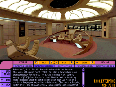
Through the use of QuickTime VR – the same tech you may have seen on real estate websites that let you take a “virtual tour” of a house – you can move around five authentic Star Trek bridges (TOS Enterprise, TNG Enterprise, Defiant, Voyager, and First Contact-era Enterprise) using panning images from cameras taken to the actual sets (with one exception). It gives you a view you’d only get from the Paramount lot, and adds a sense of perspective and placement missing from only watching the show (I had the layout of Picard’s ready room totally wrong in my head). If this doesn’t sound too geeky to you, read on to see if it might be worth a scour on Ebay.
I should first set up that I’m a fan of “old” Trek. I haven’t watched an episode since The Next Generation, and haven’t seen a movie since First Contact. Why? Not sure, but it boils down to lack of interest. Perhaps TNG got so stale that I got bored with the concept. Perhaps I simply never loved Trek enough to track four separate, ongoing stories, or set my VCR to continuously record UPN. I bring this up, because I took it as a bad sign that I didn’t recognize the bridge on the cover. (It’s the Defiant – a mini-ship they apparently invented when the writers got bored of all the episodes of Deep Space Nine taking place on Deep Space Nine.)
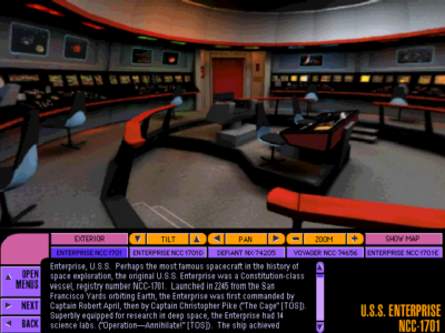
So that’s the first warning. Older Trek, while not totally absent, is not as featured here as it ideally would be. You do get the bridge of the original Enterprise, but rendered in CG. It’s nice, don’t get me wrong, and features all the functionality of looking around freely as with the other bridges. It’s also better than nothing at all, considering that the set no longer exists, and they weren’t thinking about virtual multimedia tours back in the ’60s. What’s more annoying is that less effort to retroactively explain console functions has been taken with the original bridge, compared to the other shows (more on that in a bit). I also would have loved to have wandered the bridge from Star Trek VI (the 1701-A) but alas, it isn’t featured.
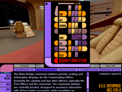
Navigating around is fairly simple. A row of buttons runs along the bottom of the viewer window, which allow you to jump to any of the bridges at any time. The viewer window shows the current bridge, and standard QT VR controls shift your view. Clicking inside and holding allows you to move your mouse in the direction you want to pan, and clicking when the hand icon changes allows you to move to a new position, or zoom in on a particular piece of equipment. You’re limited to 360-degree views from only a few static points around the bridge, but they cover all the angles. Zoomed-in views open a 2D window of the panel (so you lose some of the immersion of interacting with the panel itself), but these are easy to scroll, and the buttons are clear to read.
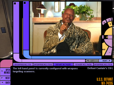
You can take a brief “guided tour” at any time, with one of five Trek notables (Takei, Mulgrew, Dorn, Frakes, Brooks) providing a voice-over as the camera automatically switches to particular stations. These are somewhat interesting, but lack depth. You don’t get the personal stories you might expect, and many take a perverse, almost pornographic tone when describing the weapons systems. (Favorite: Avery Brooks’ “I DESIGNED THEM MYSELF!”) You also don’t get anything like a “behind the scenes” commentary from the set designers, or anyone involved with the production. I would have enjoyed hearing about how they actually constructed the sets, or some details that went into making them come alive for the cameras. Instead, this is treated as an in-character tour of the “real” bridge – some nonsense about being a “StarFleet historical simulation” – and the point of the game will be to wander around the bridge at your own pace, discover new panels, and try every button in sight.
Which brings us to the second warning. I can guarantee that the experience won’t be as cool as you think it is in your head. Captain’s Chair has the direct involvement of Mike and Denise Okuda – the actual coordinators who get paid to define what does what and goes where – so this is as official as it’s going to get. Even so, the vast majority of the game is what I will politely call “undefined.” I do have to give them credit, in that you can zoom in on every single panel that you can see, and the 2D “working” version matches the layout of the set’s panel exactly. Unfortunately, the vast majority of the buttons are static and cannot be pressed. What you can interact with almost always does nothing more than chirp or alter a visual pattern (flash, change a looping sensor display, etc). Only a handful will actually activate some aspect of the ship. You’re not going to learn the exact layout of Chekov’s console, and I guess Data just remembers that the generic button labeled “1239” runs a level whatever diagnostic. You’re going to see an expert replication of the layout of unlabeled multicolored buttons from the set, and no attempt to explain what they’re supposed do.
Now yes, I get it. These are sets, the consoles are dummies, and the actors just pretend to do whatever the script calls for. I understand that. With that in mind, why bother making a game/encyclopedia/interactive multimedia experience in this style at all? If it’s all fake, and I’m asking too much by expecting every switch to have a purpose, then what exactly is this a tour of? Going back to what I said earlier, I’d love to hear about how the sets were built and some war stories from shooting the episodes. Instead, the designers decided to pretend this is a real, operating bridge, and assumed that Trek fans are going to be delighted by a couple of flashing lights and transparencies. You can’t have it both ways.
Not to say that you can’t engage the warp drives, fire weapons, and run sensor sweeps with the appropriate buttons, because you can. Still, even these only trigger fairly disappointing clips from the shows as the ship in question performs the appropriate action and engages off-camera attackers. I’ve seen a third-person view of the Enterprise firing torpedoes before – hell, I’ve seen THAT SHOT of the Enterprise firing torpedoes from the show – I’m looking for something that maintains that whole virtual aspect. I don’t get a sense of what it’s like to fire weapons by pressing a button and seeing a recycled show clip.
Granted, sometimes Captain’s Chair did surprise me, and these are the moments that it becomes less like Encarta and more a game like Myst. You can’t activate the helm on the original bridge until you go over to Scotty’s station and find the button to turn on the engines. Voyager requires you to go through a sequence of arming weapons and locking targets before you can fire phasers. Some of the bridges keep a precise log of all your activities, so you can find the station that will embarrassingly remind you of when you accidentally decompressed the shuttle bay. These are glimpses of what I would have loved to have seen throughout.
Easter eggs also abound, both in little gag animations or hidden games (like Pong and Tetris clones), and give you the reason to keep punching buttons that the otherwise lifeless consoles lack. You can even find a secret code and the place to enter it to get a sixth bridge – a Klingon Bird of Prey (no panels or interactivity here, though). Each bridge also has a secret video message from the five actors, loosely talking about their experiences and profusely thanking the fans. It’s good stuff, but there’s precious little of it.
I should also note that this is pretty much a visual exploration. Text descriptions of equipment and stations are surprisingly terse, frequently only limited to what the station’s is (“Science Station”) and not what it does (“The Science Station is where… and is able to…”). You get diagrams you can mouse over and get a feel for the layout, but the equipment is still not explored. This is not in any way meant to compete with the TNG Tech Manual, even though it would have far more value if it did. Meanwhile, character biographies of the crew can be found, and are ridiculously detailed – and annoyingly cite episode references after every other sentence. If you think this review is getting too long, these crew bios will give a whole new concept of what “too long” means.
Graphically, it’s a pretty sharp title. Pictures look like standard digital stills, the CG TOS Enterprise isn’t all that bad, and text is easy to read on panels. There’s little tearing or distortion as the camera moves around, and you can park it anywhere and get a clean still frame. Sounds are appropriate and authentic. Controls are easy to use. About the only annoyance there is that sometimes the window controls stop working, and you have to use manual pan/tilt controls at the bottom of the screen. No reason why, and seems to be a bug. Also be aware that modern support for this version of QT VR isn’t so hot, so expect to knock your system back to QuickTime 3.0 to run this.
Is it worth roaming around each bridge and curiously examining consoles? Sure. Is it worth scouring every corner, or coming back to again? Absolutely not. This is not a virtual replication of the five bridges, and shouldn’t be thought of as such (despite what the cover tells you). This is not a production tour of how the show or bridges are made. This is just a limited tour of the physical sets, done mostly on the cheap. Despite promises on the cover, Captain’s Chair isn’t going to show you much, isn’t going to teach you anything, and isn’t going to answer any questions about how the command centers of your favorite starships actually tick.


 Posts
Posts